Maintaining Nationwide Brand Consistency in Commercial Property Media
Introduction
A brand is defined by its consistency. In the B2B space, how your physical properties and locations look online is often the first touchpoint for customers, investors, and prospective franchisees. If a customer visits your store locator page and sees a different style of photo-editing from a different photographer shooting each location, it immediately signals a lack of operational standards.
Today, maintaining brand consistency in commercial property media across a nationwide footprint is not just an aesthetic challenge, but a critical marketing requirement.
The Danger of Fragmented Post-Production
The primary reason commercial property photos look inconsistent across different locations is the fragmentation of post-production. Even if you establish strict photography guidelines, different photographers all have different post production softwares, styles, and tastes, creating a hodgepodge feel to your imagery.
If you leave the editing up to individual local photographers:
- Color Temperature Variations: Some locations will look warm and yellow, while others look cold and blue.
- Saturation Style Differences: Some photographers edit with a lot of saturation and "pop." Others lean towards more minimal, sleek, desaturated edits.
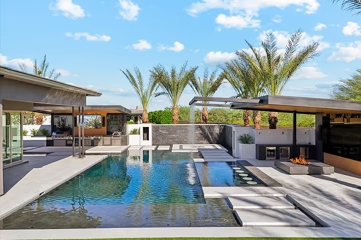
- Varying Sky Replacements: Some photos will show bright blue skies, others may be gray and overcast, breaking the visual harmony of your website.
The Solution: Centralized Quality Assurance (QA)
To achieve true brand consistency, raw visual assets must be funneled through a centralized editing and quality control process. Under this workflow, local photographers are only responsible for the raw capture, following strict brand guidelines. All post-production is handled by a single, dedicated team.
Critical Standards to Control Globally:
- Vertical Alignment: Ensuring that the architectural lines of buildings are perfectly straight and vertical. This gives a professional, high-end look to real estate and retail portfolios.
- Color Grading & Saturation: Standardizing color spaces so that your corporate brand colors look exactly the same across every photo.
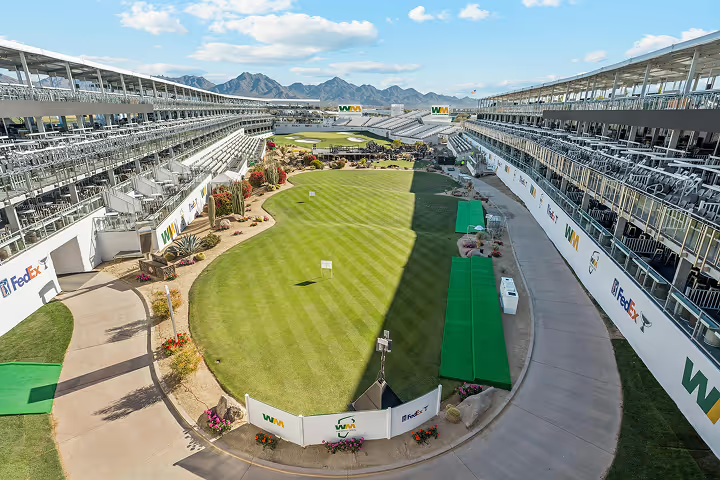
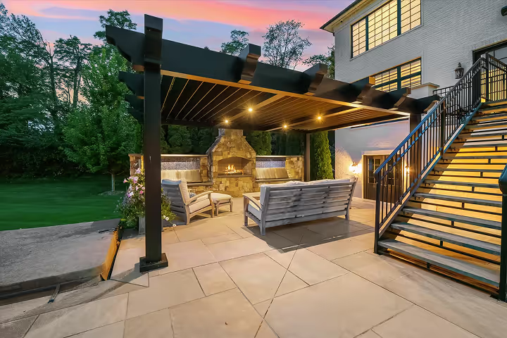
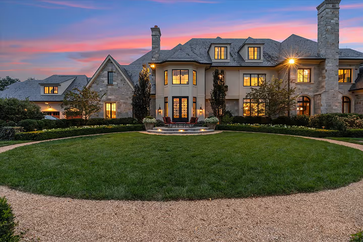
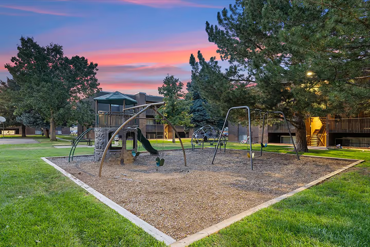
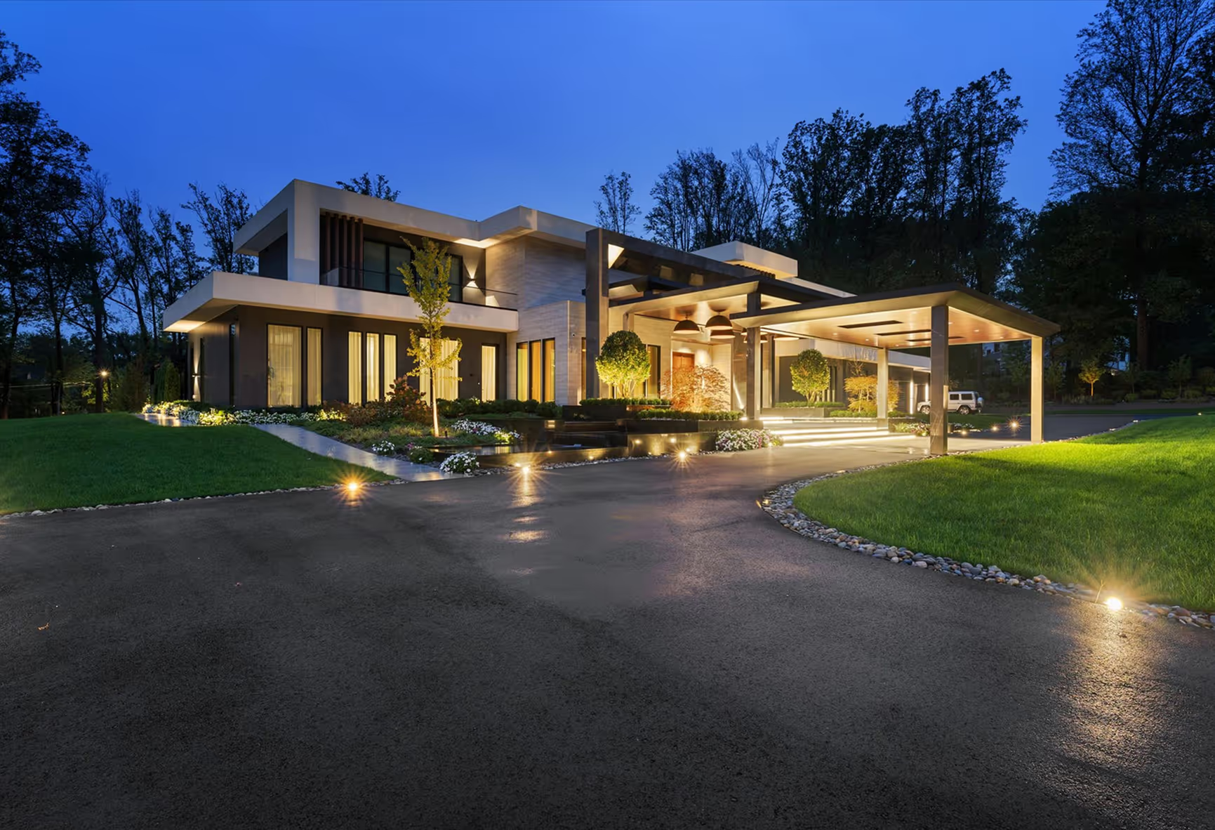
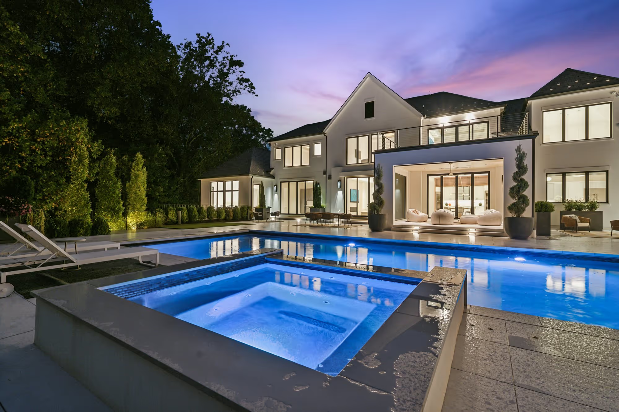
- Sky Standardization: Replacing dull, overcast skies with clean, natural blue skies or consistent twilight gradients to ensure a clean visual flow on multi-location directory pages.
- Clutter Removal: Digitally removing distracting elements like trash cans, power lines, or stray vehicles that detract from the property's premium appearance.
Brand Consistency as a Growth Driver
When your property media is standardized, it directly impacts the performance of your marketing channels:
- Improved User Experience (UX): Store locators and directory pages look cohesive, increasing time-on-site and user engagement.
- Higher Conversion Rates: Clean, consistent property photography builds trust, leading to higher inquiry rates for self-storage, multi-family, retail, and hospitality brands.
- Stronger Franchise Appeal: For franchise brands, showing a high level of visual operational control is a major selling point for potential partners.
Don't let decentralized vendor management dilute your brand's visual identity. By establishing a centralized quality assurance workflow for your commercial property media, you ensure that every location represents your brand at its absolute best.